

BandWagon (full documentation here) is a Python library to predict and plot migration patterns from DNA digestions. It supports hundreds of different enzymes (thanks to BioPython), single- and multiple-enzyme digestions, and custom ladders.
It uses Matplotlib to produce plots like this one:
BandWagon
License = MIT
BandWagon is an open-source software originally written at the Edinburgh Genome Foundry by Zulko and released on Github under the MIT license (Copyright 2019 Edinburgh Genome Foundry, University of Edinburgh).
Everyone is welcome to contribute!
Installation
BandWagon can be installed with pip:
pip install bandwagon
To create interactive Bokeh plots, install additional packages with:
pip install bandwagon[bokeh]
Examples of use
Computing digestion band sizes
This first example shows how to compute digestion bands in the case of a linear fragment, a circular fragment, and a multi-enzymes digestion:
from bandwagon import compute_digestion_bands

# Read the sequence (a string of the form 'ATGTGTGGTA...' etc.)
with open("example_sequence.txt", "r") as f:
    sequence = f.read()

# Compute digestion bands for a linear construct
print(compute_digestion_bands(sequence, ["EcoRI"], linear=True))
# Result >>> [400, 1017, 3583]

# Compute digestion bands for a circular construct
print(compute_digestion_bands(sequence, ["EcoRI"], linear=False))
# Result >>> [1017, 3983]

# Compute digestion bands for an enzymatic mix
print(compute_digestion_bands(sequence, ["EcoRI", "BamHI"]))
# Result >>> [400, 417, 600, 3583]
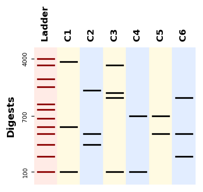
Plotting bands
from bandwagon import BandsPattern, BandsPatternsSet, LADDER_100_to_4k

ladder = LADDER_100_to_4k.modified(label="Ladder", background_color="#ffffaf")

patterns = [
    BandsPattern([100, 500, 3500], ladder, label="C1"),
    BandsPattern([300, 400, 1500], ladder, label="C2"),
    BandsPattern([100, 1200, 1400, 3000], ladder, label="C3"),
    BandsPattern([100, 700], ladder, label="C4"),
]
patterns_set = BandsPatternsSet(patterns=[ladder] + patterns, ladder=ladder,
                                label="Test pattern", ladder_ticks=3)
ax = patterns_set.plot()
ax.figure.savefig("simple_band_patterns.png", bbox_inches="tight", dpi=200)
Plotting a gel simulation
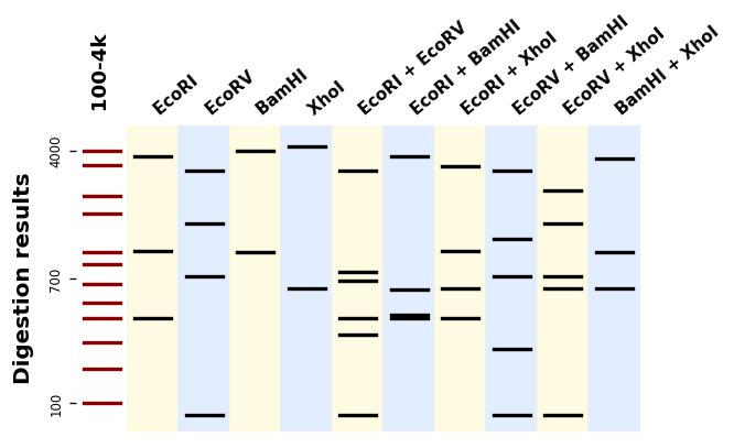
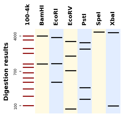
Let us plot digestion patterns produced by different restriction enzymes on the same DNA sequence:
from bandwagon import (BandsPattern, BandsPatternsSet, LADDER_100_to_4k,
                       compute_digestion_bands)

with open("example_sequence.txt", "r") as f:
    sequence = f.read()

patterns = [
    BandsPattern(compute_digestion_bands(sequence, [enzyme], linear=True),
                 ladder=LADDER_100_to_4k, label=enzyme)
    for enzyme in ["BamHI", "EcoRI", "EcoRV", "PstI", "SpeI", "XbaI"]
]
patterns_set = BandsPatternsSet(patterns=[LADDER_100_to_4k] + patterns,
                                ladder=LADDER_100_to_4k,
                                label="Digestion results", ladder_ticks=3)

ax = patterns_set.plot()
ax.figure.savefig("digestion_results.png", bbox_inches="tight", dpi=200)
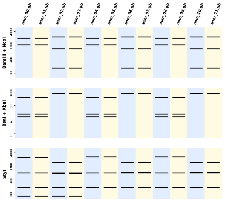
If you have many sequences and digestions you can also use the utility plot_records_digestions
from bandwagon import plot_all_digestion_patterns, LADDER_100_to_4k

axes = plot_all_digestion_patterns(
    records=records,
    digestions=[('BamHI', 'NcoI'), ('BsaI', 'XbaI'), ('StyI',)],
    ladder=LADDER_100_to_4k
)
axes[0].figure.savefig("plot_all_digestion_patterns.png")
Plotting patterns alongside annotated records
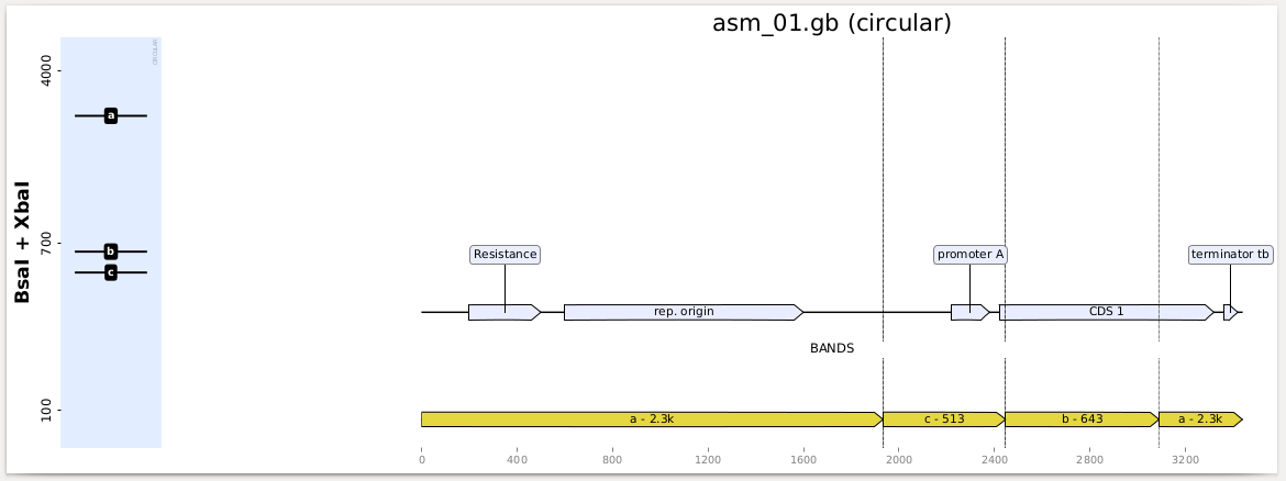
You can also get a full report with indications of where in your sequences the bands are formed (which is useful for troubleshooting) as follows:
from bandwagon import plot_records_digestions, LADDER_100_to_4k

plot_records_digestions(
    records=records,
    digestions=[('BamHI', 'NcoI'), ('BsaI', 'XbaI'), ('StyI',)],
    ladder=LADDER_100_to_4k,
    target="records_digestions.pdf")
You get a PDF report with one page per construct and digestion, looking like this:
Using a custom ladder
You can define a custom ladder by providing a dictionary of the form
{ actual_size_of_the_fragment: observed_migration_distance }
For instance here is how the 100b-4kb ladder (provided with BandWagon) is defined:
from bandwagon import custom_ladder

LADDER_100_to_4k = custom_ladder("100-4k", {
    100: 205,
    200: 186,
    300: 171,
    400: 158,
    500: 149,
    650: 139,
    850: 128,
    1000: 121,
    1650: 100,
    2000: 90,
    3000: 73,
    4000: 65
})
The unit of the “migration distance” from the starting point is not very important, it could be millimeters on a gel, pixels in an image, etc.
If you are lucky enough to have an AATI automated fragment analyzer like us at the
Foundry, it will output a .csv calibration file after each run, from which you
can generate a ladder with:
from bandwagon import ladder_from_aati_fa_calibration_table

ladder = ladder_from_aati_fa_calibration_table("Calibration.csv",
                                               label="todays_ladder")